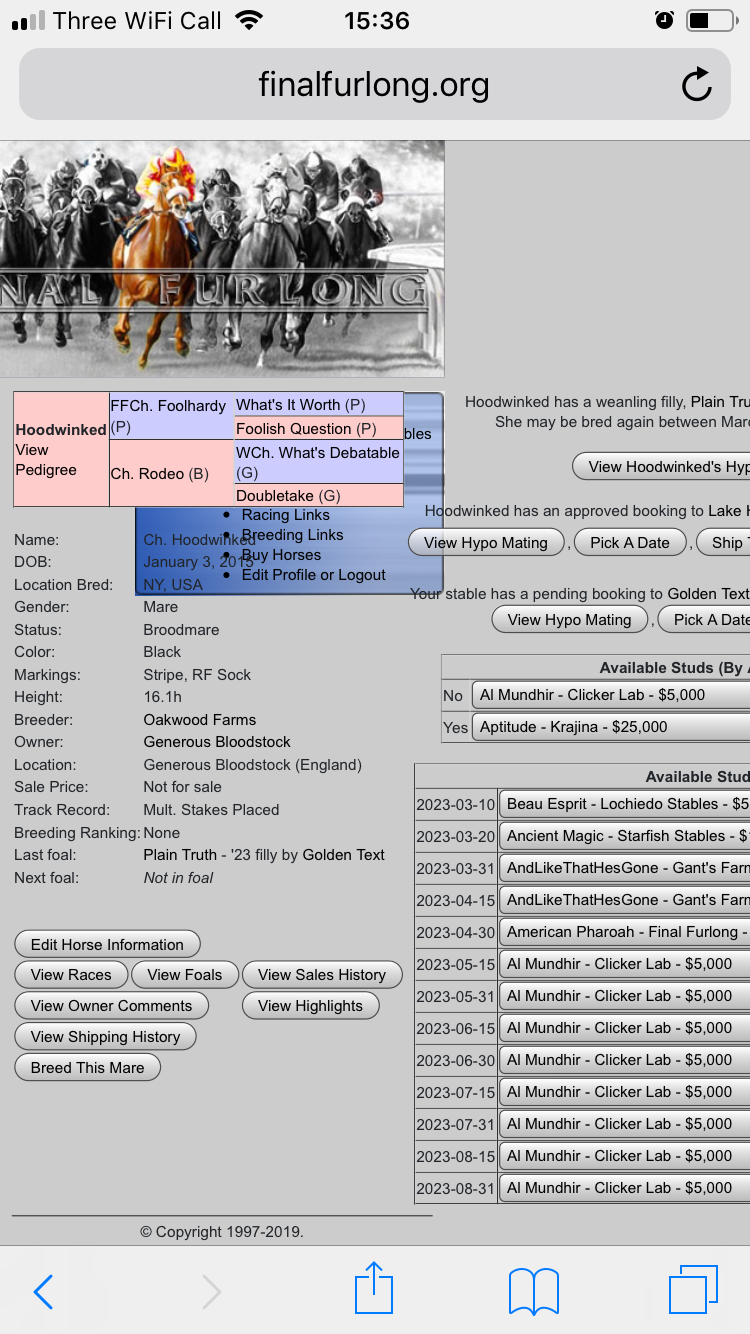
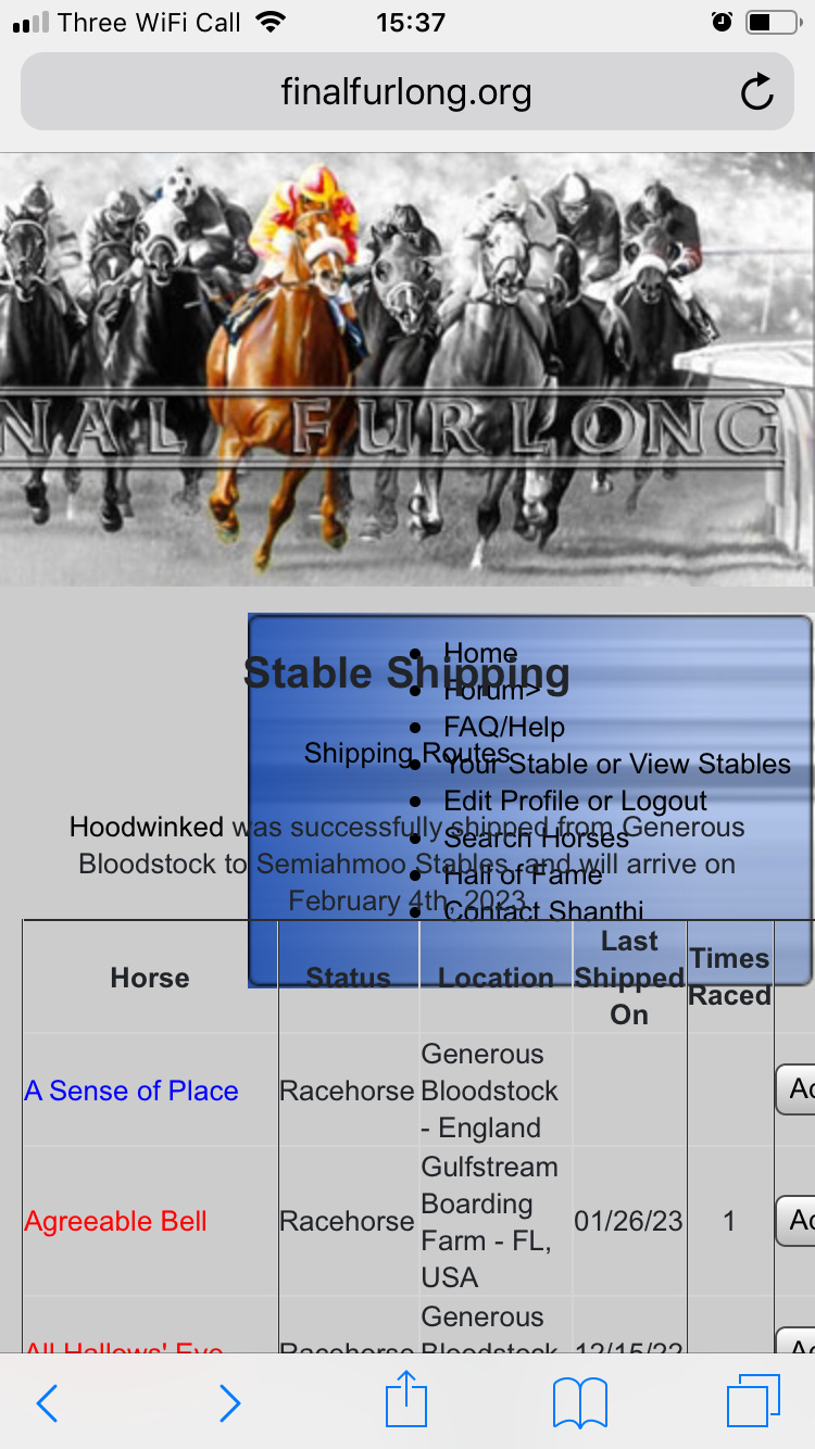
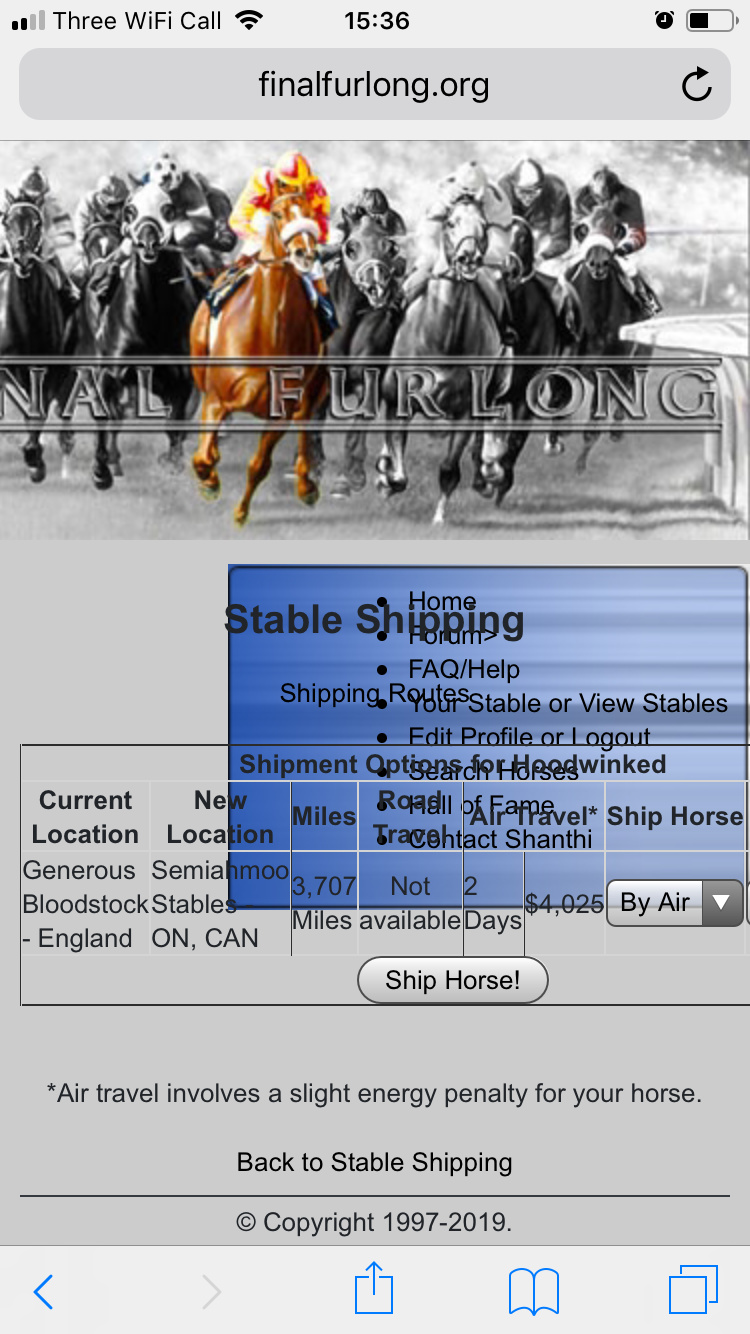
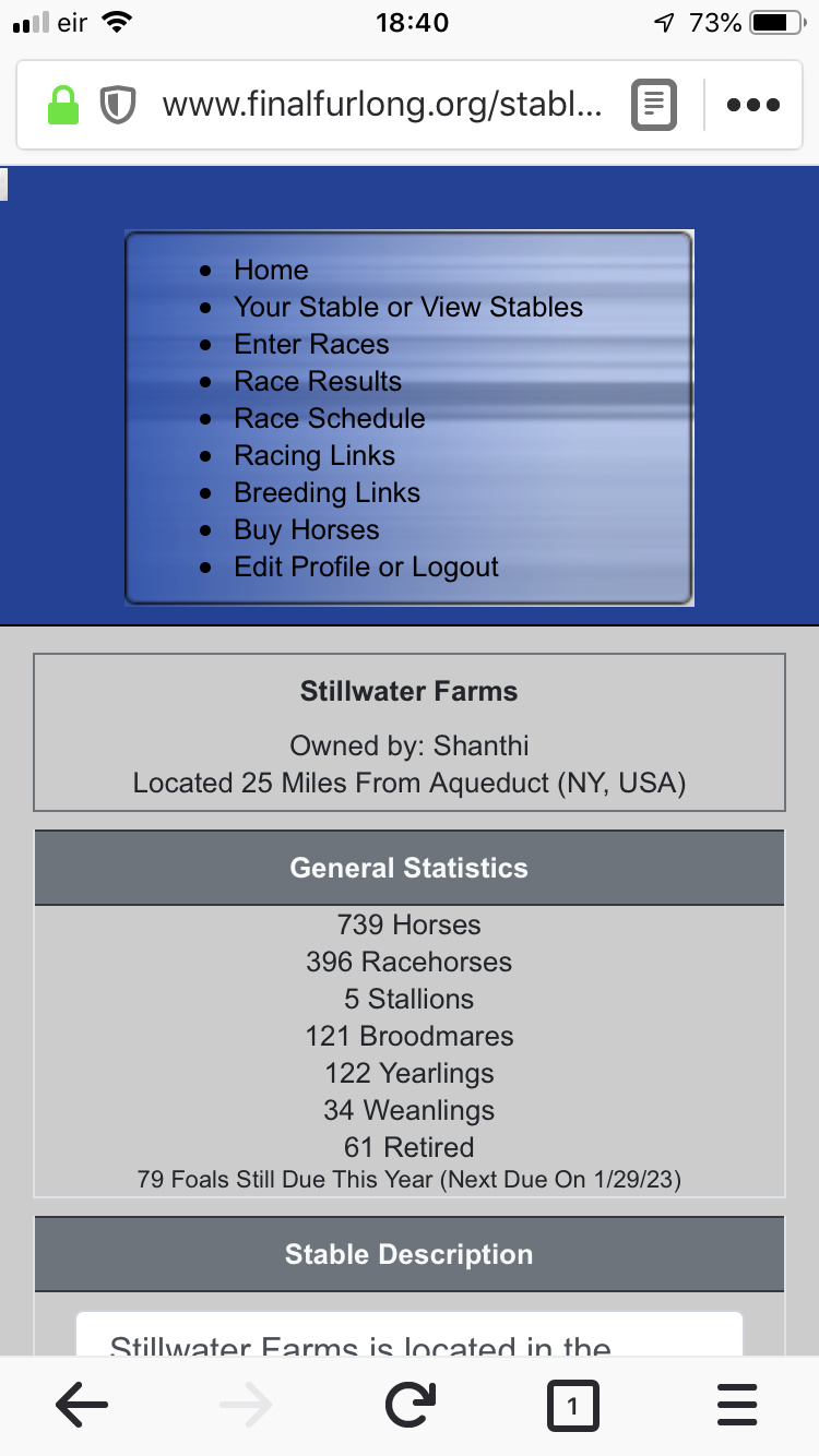
Wonky layout when viewing stable page on mobile
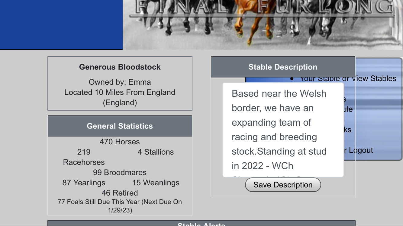
My stable description now appears over the top of the box that contains the Racing & Breeding links, enter race links etc. It’s the same regardless of phone orientation although the page in general looks better is I hold it ‘landscape’ as opposed to portrait. I’ve tried logging out and back in again but this hasn’t made a difference. It’s fine if I view it on my laptop
Steps to Reproduce
Outline the exact steps to reproduce the issue, ideally with screenshots and links (as appropriate). Template:
- Login
- From the forum, click ‘Stable’
- Stable overview page loads but the links art the top are hidden by my stable description box
Additional information
I can partially see the view stables link but it the hyperlinks don’t appear to work if I attempt to click on it. I’m using an iPhone with Safari. (I use Chrome on my laptop)
